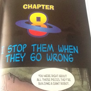
 Charles Schulz’s lettering style was distinct. I’m used to seeing the work of a lot of professional comic book letterers (from the old days of hand lettering; most of it is done by computer now), but I’m used to seeing each letterer’s work being placed over a range of different artists. While Schulz was briefly a professional letterer before his own cartooning career took off, it was before his lettering style was fully developed. So when I see something that looks like Schulz lettering from the later years, and it’s not on Schulz art, I get taken aback. However, there have been a number of computer fonts generated based on his lettering, and while those are sometimes seen in a Peanuts context, sometimes they are not… such as the illustration that is here. This particular example is from Hilo: The Boy Who Crashed to Earth, the first in a new graphic novel series from Judd Winick (who a few of you may remember from his days on MTV’s The Real World, and who the comics cognizant may know from such acclaimed works as the moving Pedro & Me and the hilarious Barry Ween, Boy Genius, but who I know because hey, he provided cartoons for some of the Complete Idiot’s Guide books I wrote, and then we got to know each other online and at conventions.) Used just for the chapter headers and differing strongly from the font used in the dialogue balloons, this really leaps out and makes my brain go “hey, what’s that doing here?”

