Comics sans appropriate font

The other day, I praised the Easton Press edition of A Peanuts Valentine, noting that the cover of the fancy edition looked better than the standard edition, but that that wasn’t always the case for their books. Today, I noticed this example of the lesser work:

ManyFacesEaston

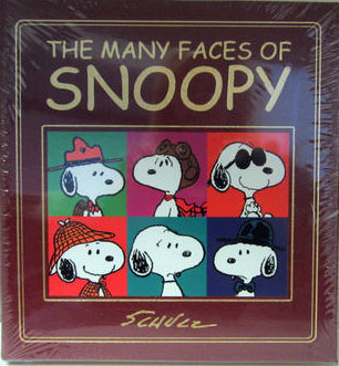
While A Peanuts Valentine has a logo in a font based on Schulz’s own lettering, The Many Faces of Snoopy used Comics Sans, the dreaded faux comics font. It’s blatantly not Schulz, and it’s ugly and awkward; the font’s bad native kerning makes it look like THE MANY F ACES OF SNOOPY. And while I approve of putting Schulz’s signature on the cover, might they have found a more graceful example? I’m not saying that the paperback version is the best looking Peanuts book of all time, but it’s better than this.

Share the news!
New releases
The World According to Snoopy and sundry other things

I just picked up a copy of The World According to Snoopy, which was released in the UK late last year. This hardcover book, with its cover akin to a 1970s textbook, falls into the “inspirational messages” category. It’s pages are a mix of single-page displays of individual Peanuts strips (always …

book adaptations of A Charlie Brown Christmas
Review catchup

I apologize for the lack of reviews in a while. It’s my own fault… and the fault of that new Hallmark edition of A Charlie Brown Christmas which interacts with a stuffed animal. “That would be a great review to do as a video”, thought I. But videos take time to …

New releases
Review: Where’s Snoopy?

The thing it understand about the new hardcover Where’s Snoopy: A Search-and-Find Book by Natalie Shaw and Scott Jeralds is that this isn’t really a puzzle book a la Where’s Waldo? or some of those books of richly detailed photographs where it really takes careful poring over to locate the missing …