A look at the designer

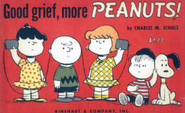
Chip Kidd’s book on Peanuts from a few years back drew both adoration and derision (I fall into the former camp, but that’s because I don’t see it as The One Way Peanuts Should Be Seen as much as An Interesting Alternative Way Of Looking At It; there are so many hundreds of Peanuts books, we certainly have room for that!)

Well, here’s Mr. Kidd, aggressively styled himself, talking about how he approaches book design. None of it is about the Peanuts book specifically, but some of it is relevant to how he handed it, I think. (It’s a TED talk, for those of you to whom that means something.)

Share the news!

Uncategorized
A thing that might have been

In 1958, the vocal jazz/pop band The Hi-Lo’s were riding high. Having released their first album in 1954, they were already working on their eighth… and they wanted to name it after a Peanuts book. As the Washington D.C. newspaper The Sunday Star reported, they were floating the idea of …

Uncategorized
Charles’s Angel

In 1961, Charles Schulz designed a promotional character for the United Fund (i.e., the group that is now called United Way.) He gets named “Little Angel”… or, depending on the press release, “Little Good Guy”. The character appears in promotions for a few years. The reworks of him, which are …

Uncategorized
Up and down, up and down

AAUGH Blog reader D.D., who heads the fine blog The Daily Cartoonist (go check it out), put in the time to find an example of the one eight-panel Peanuts daily in vertically-stacked format, as I mentioned wanting to find in a previous post. Go take a gander at its verticalness! …